Case Study: Halving the length of the contact form increased enquiries by 54%
As well as a cookery school and conference area, Braxted Park is a beautiful wedding venue in Essex. We’ve successfully worked with them in terms of organic visibility for years so when they came to us with concerns over the conversion rate of their enquiry form, we couldn’t wait to help.
There’s lots of evidence to suggest reducing the number of fields in an enquiry form results in a higher conversion rate, and so this along with some user feedback and data from Google Analytics lead us to design a variation with fewer questions and therefore far fewer fields.
The Control
The original version of the form was attractive, but with 24 fields, it was long and asked for details that were deemed as non-imperative at the initial enquiry stage:
- Braxted Park’s Old Contact Form
Our Variation
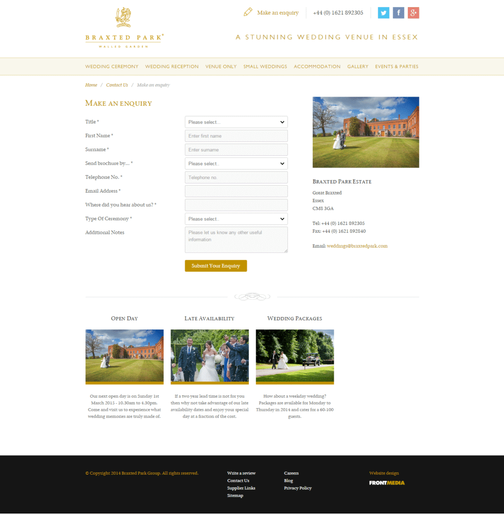
We tweaked the layout, pretty much halved the length of the form, and with a bit of JavaScript, hid some fields unless they were needed (namely, the address fields if users want a brochure by post):
- Braxted Park’s New Contact Form
The Results
A 54% increase in enquiry form submissions!
Learnings
Basically, ask fewer questions. The data showed us that prospective brides and grooms didn’t want to divulge who they’re marrying, give three phone numbers and confirm their wedding date and guestlist to order a brochure. Similarly, if they’re looking for a digital version of the brochure only, a postal address is unnecessary and may even feel a little invasive.
So, is there a winning formula for a form? Kinda. Users need to consider an organisation trustworthy before handing over their personal details. With that in mind:
When creating your contact form, remember:
Be Honest – Make it clear why you want the information you’re asking for. Studies show users appreciate honesty
Be Moral – Only ask for information you absolutely need, the bare minimum, will encourage users to trust you
Be Pretty – In her book “Webs of Influence” Nathalie Nahai suggests avoiding garish colours that can look sales-y and therefore untrustworthy
Be Generous – Offer your users incentives for giving up their information. In the case of Braxted Park, an attractive “thank you” page with a prompt to follow them on Facebook for news/offers/wedding ideas would work well
Be Testing – When you’re putting together your site’s contact form, ask yourself if you really need that piece of information RIGHT AT THAT MOMENT. If the answer isn’t “yes, absolutely” then maybe you shouldn’t be asking it at all… An A/B Test will help clear up that confusion for you!


