I am a self confessed data geek and really enjoy exploring ways to analyse numbers in order to understand performance. I think it is fairly impossible to love digital marketing if you don’t have a passion for data.
I am also a subscriber to the ‘a picture is worth a thousand words’ adage and appreciate the challenge of distilling complex data to present a meaningful story. We used to use Tableau as a dash-boarding tool to help visualise data but I have become a big fan of Google Data Studio in recent years. The power on offer is extremely impressive considering that it is (currently) free. If you haven’t tried it and you love data visualisation, you should most definitely spend some time using it.
It is easy to use and especially easy to connect with other Google properties. For example, connecting to Search Console, Google Analytics and Google Ads is staggeringly easy and you can quickly build dashboards that pull in data from all three sources to give you a holistic picture of how your website is performing across both paid and organic channels.
There are, however, some limitations when pulling in data from multiples sources into a single chart (a ‘chart’ being any of the reports readily available in Data Studio, which include tables and pivot tables). Thankfully, these limitations are overcome by the very powerful ‘data blending’ feature.
What is data blending?
By default, Google Data Studio charts can only use one data source. This isn’t always a problem as you can have multiple charts on a single slide, so can show a wide variety of data in a simple view, but the ability to create a ‘blended data source’ allows you to join records in one data source to the records of up to four other data sources. A single chart can then use the blended data source to show data from all five data sources, which allows you to show much more information in that chart.
*A quick aside* : Although most instances of data blending will be to use multiple data sources in one chart, you can actually blend a data source with itself. A good example of this would be if you want to have a chart showing 1 day active users, 7 day active users, and 28 day active users data from Google Analytics. Annoyingly, Analytics will not allow you to have all these metrics in one chart at the same time. By blending the Google Analytics data source with itself, you can then add all the metrics to the one blended data source and, hey presto, compare the metrics in one chart.
A good example of when you may want to blend data sources is when looking at individual page performance.
Blending Google Analytics and Google Search Console data to analyse page performance
If I had to pick one tool to measure the performance of individual pages, I would pick Google Analytics. It is fantastic at telling you pretty much everything you need to know about how users are engaging with any particular page, including aspects such as scroll depth, which I looked at previously. It doesn’t tell you anything, however, about performance in the SERPs which is where Search Console data can help. If you don’t use Search Console, you really should sign up today – it is another free and excellent offering from Google.
A potent trio of Google Data Studio, Google Analytics and Google Search Console can give an excellent insight regarding the performance of content on your website. I wanted to give an example of how blending this data can give you an excellent report that would not otherwise be possible in one chart. For this post, I am assuming a basic level of familiarity with Google Data Studio, but it is very easy to do and even early Data Studio rookies should be able to follow the instructions.
Frustratingly, Google Analytics and Search Console do not play as nicely together as you would hope and this process starts with a quick fix…
1] Create Custom field
To create a blended data source, you need to ‘join’ two fields. The frustration, in this case, is that Google Analytics treats URLs in a different way, by default, to Search Console. Analytics does not use the full URL, whereas Search Console does. i.e. https://browsermedia.agency/blog/ecosia-versus-google/ (one of the all time highest viewed blog posts on our site) will be reported as ‘/blog/ecosia-versus-google/’ in Google Analytics, but ‘https://browsermedia.agency/blog/ecosia-versus-google/’ in Search Console.
Although they both refer to the same page, the fact that they are written different will mean that you cannot use them as the join key, which makes the wholistic page analysis that I am looking for impossible to do. The fix is either to add ‘https://browsermedia.agency’ to the Google Analytics data or to remove it from Search Console data.
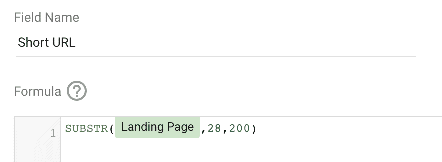
Since I want the shortened form in my reports (for space efficiency), I typically choose to shorten the URLs in the Search Console data. To achieve this, you need to create a custom field, which I have called ‘Short URL’ and use the following formula:
You will need to change the ’28’ to suit your particular domain – 28 works for our site (although there are only 27 characters to remove by my reckoning?) . You can test that it is doing what it should do by creating a quick table in Data Studio using the Search Console data source with ‘Short URL’ as the dimension and ‘Impressions’ as a metric.
You should see the URLs in the same format as a Google Analytics chart. Assuming that is the case, you are ready to create a blended data source…
2] Blend Data
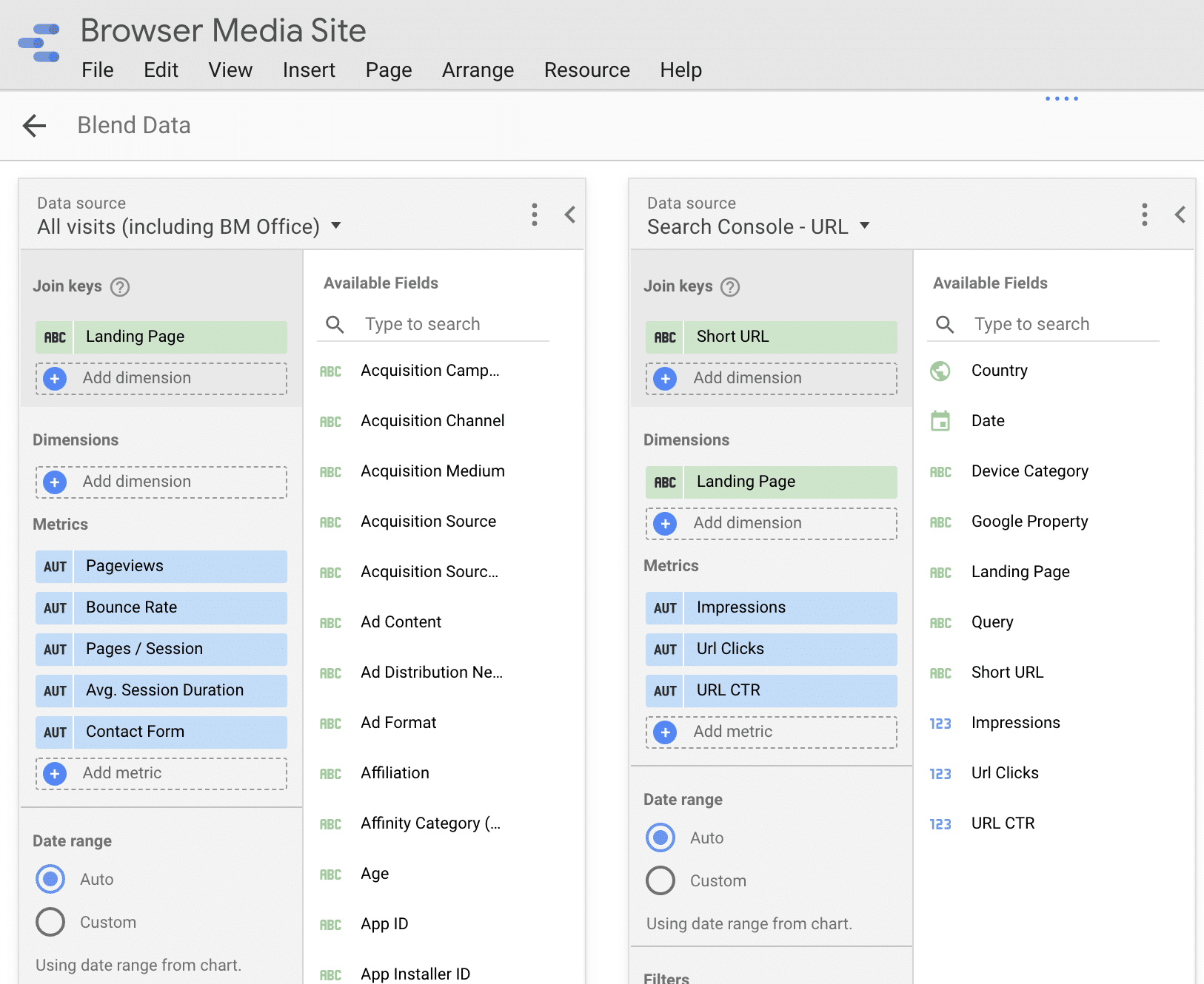
As noted above, any blended data source requires at least two fields to be joined. There are several ways that you can create a blended data source, but I typically go to ‘Manage blended data’ via the ‘Resource’ menu:

From this page, you simply need to select ‘Add a data view’ and then select your Google Analytics and Search Console data to start the blending process. As we want to look at individual page performance, we are going to use ‘Landing Page’ from the Google Analytics data and the ‘Short URL’ custom field that we created above as the join keys.
You then need to add any metrics that you will want to use for this blended data source. For the report that I want to create, the following works well:

You can always edit the blended data source, so don’t worry if you forget to add any particular metrics when setting it up for the first time – I am almost always guilty of having to go back and add metrics once I start to build charts using the blended data source. This often breaks the chart, but a quick browser refresh will fix that and you are back up and running.
3] Create Charts
You now have a very rich set of data that is pulling in information from both Google Analytics and Search Console, so it is time to get creative and build charts that make the most of the combo.
You can use the blended data source in any chart type, but I want to create a table to show how pages are performing both in the SERPs and once users arrive on the page.
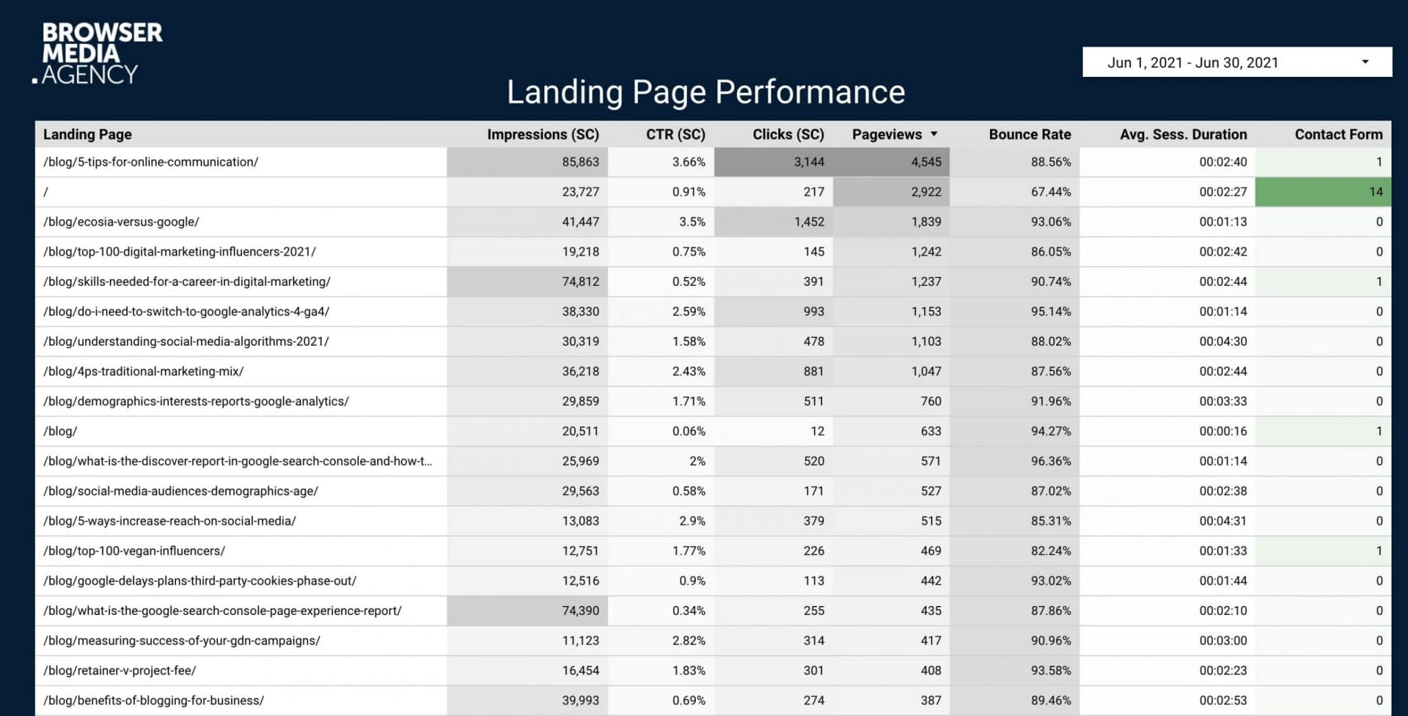
This can be achieved by creating a simple table chart with landing page as the dimension and adding the following metrics (columns):

As shown above (which is a summary of June 2021), the first three columns are all Search Console data whilst the remaining information is pulled from Google Analytics. I added some heatmap colouring to help identify peaks and troughs but have sorted the table by page views, as I wanted to focus on the most popular pages on the site.
I hope that this could be a helpful report to use when analysing pages on a website?
It is interesting to see how data varies between Search Console and Google Analytics. This is not a fault of the blended data source and is simply a reflection of inherent variations in data between the two platforms, which is complex and warrants a blog post in its own right. In this particular example, the Google Analytics data is showing performance for each page for all traffic sources, so you would expect page views to be higher than Search Console clicks. You can, of course, apply segments to the Google Analytics data if you want to examine particular traffic sources.
Experiment
The example above is a simple example of a fairly straight forward data blend. As with most platforms, you will learn most by building reports yourself. Google Data Studio is definitely worth exploring and the potential that blended data sources offers is remarkable and is often the answer if you are struggling to find the perfect chart to present the information that you wish to display.
Have a play and see what you can achieve with data blending.


