After enjoying the all-new Browser Media UX Games post yesterday, I couldn’t help but feel Ashleigh’s pain when she was moaning describing her frustration when browsing blinds online:
… there are only 8 products on each page! You have to click through the pages to see the different designs…
It got me thinking about what it means to give visitors to your site a choice, whether it’s between products, services or whatever else. There’s power in making a choice. Offering users the chance to decide what they believe is best for them personally means they’re fully in control of their situation – they write their own destiny, which is something McClelland and Burnham claim we all crave.
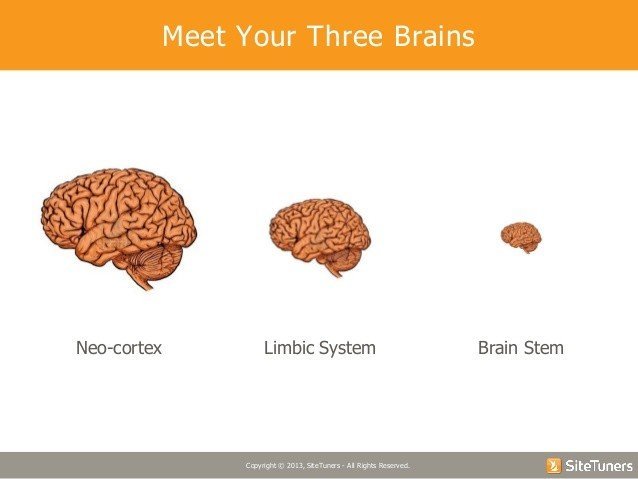
What Ashleigh experienced though, other than annoyance at the never-ending-clickage, was too much choice. The more choice we’re offered, the harder it is to make a decision. Tim Ash describes our Three Brains and their roles in our ability to make decisions:

- The NeoCortex – This is what separates us from the animals, the reasoning part of the brain
- The Lymbic System – This is present in all animals and forms emotions such as our likes and dislikes
- The Brain Stem – This is the automated part of the brain for every animal and is the instinctive part of the brain
The Brain Stem makes 95% of our decisions and it is this part of users’ brains we look to tap into by creating a few clear choices, avoiding the dreaded decision paralysis.
Consider Miller’s Law
As an ex Psychology Student, I love me some George A. Miller, and his Magical Number 7 is just one of many reasons for my doing so.
His article suggests that a person holds 7 ± 2 pieces of information in working memory at any one time. Things have changed since 1956, and there are more modern arguments to consider but I’d always keep Miller in mind when presenting users with products and services.
The following example is from a stationary site (just like Tim’s example in his webinar). 2 pages of pens, over 40 products to choose from, and that’s just in the “value pens” section. Kind of overwhelming:
The product details and price are clear enough, but it’s still tricky to compare each one effectively and there’s no function for users to filter further, therefore slimming down the choices to what they’re really looking for.
Complex choices tire the brain and so decision making becomes more laborious. Help users out by guiding them with categories, drop down menus and filters like this:

232 products but the pictures are clear, the product titles are descriptive… but the prices are kinda teensy. Look at those filters though! Colour, Type, Price – lovely stuff.
Be Kind To Your Users
People still want choice, especially if they’re not 100% clear on what they want, like Ashleigh who wasn’t even decided on colour let alone pattern. By tweaking the way you display your products, with categories, sub-categories and filters, you can break it down for your users.
Try testing filter titles (is ‘type’ descriptive enough?) or the way in which you break down categories into sub-categories (should ‘pens & pencils’ be ‘pens’ & ‘pencils’?).


