
Researchers at the University of East Anglia (UEA) just published a study that looked into users’ thoughts and feelings around purchasing on mobile:
“Shoppers hoping to bag a bargain in the post-Christmas sales are much less likely to go through with their purchases if they are using phones and tablets to buy goods online.” – via uea.ac.uk
Eek – not great news for those ecommerce bods who are investing heavily in their mobile shopping experience.
According to the study, consumers are worried that they might miss something, that they aren’t getting the “full picture” when purchasing on mobile, and may be missing special offers or discounts, or falling foul to hidden costs. As such, users are conducting their research and browsing using their mobile devices, but switching to desktop to make their purchase.
If shopping cart abandonment is much higher for mobile than it is for desktop, what can we be doing to improve the experience and encourage mobile conversions? Welp, here are a few best practices for desktop that could easily be applied to mobile:
Break down costs and fees ASAP
Users want to know exactly what to expect when they move through the checkout process, we’ve known that for a looong time, but if users are more concerned about missing something on mobile, it’s surely even more important that all costs and fees are ascertained before the checkout process begins. There’s no room for new information.
Fix it: This might be as simple as highlighting the full price, including tax, on the product page. In other cases, it might be a bit more complicated. If there are multiple factors affecting price, or multiple fees involved, they should be broken down. Consider booking a hotel and flight, for example:

Of course, it’s not always the case that you can outline costs without depending on a decision the user will have to make in the future. In this instance, including a statement like “Shipping Not Included” or “Plus P&P” will help prepare them for that added cost.
Declutter and remove distractions
Definitely a rule we should be applying to the desktop checkout also, but in light of UEA’s study, the case for removing any and all unnecessary information from the mobile checkout is as strong as ever. Users don’t want to be flummoxed by a complicated checkout – they’ve done the hard work, browsing and then choosing the product they want, so don’t make them bail on the transaction before they’ve paid.
Fix it: Users want to get in, pay, and get out, so the checkout process should be simple and intuitive. The belief that users prefer a one-page checkout has been largely rejected these days, and on mobile, a seemingly infinite scroll could lead users to believe they’ve missed something.
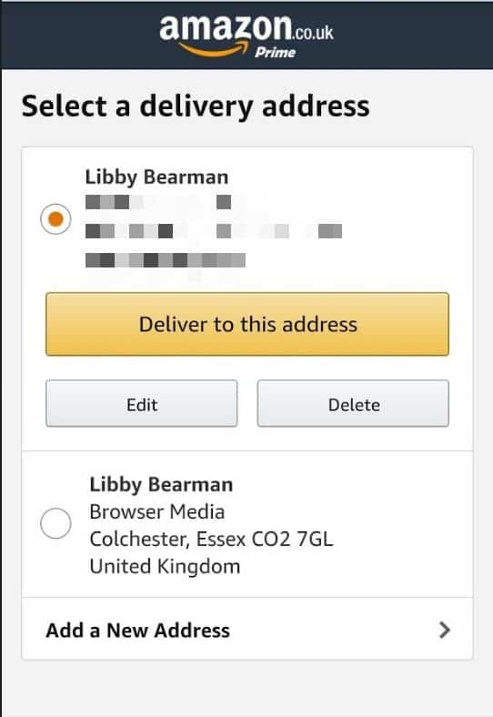
Breaking the checkout steps into bite-sized chunks that (almost) fit on one screen, ala Amazon, will prevent users from being overwhelmed or nervous about entering loads of info and missing something.
Debug to avoid any technical difficulties
Fixing any errors should be the first thing on your list of things to rectify in the checkout process. If a user physically can’t complete the checkout process, they’ve no choice but to abandon their cart – goodbye, sale!
Fix it: Stop putting it off and just absolutely fix it.
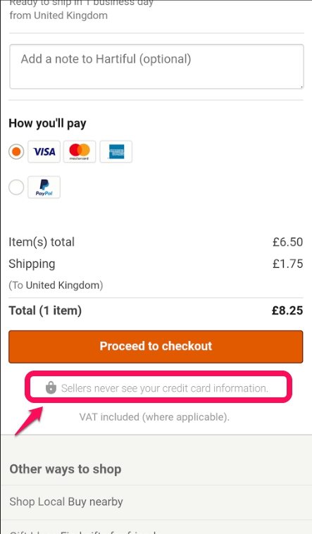
Ease buyer anxiety and encourage trust
Gaining the trust of users is such an important step in ecommerce. Winning over new customers, and getting them to part with their pennies, can be enough of a struggle in an age of data breaches and looming GDPR, but it’s harder still on mobile. Feelings of mistrust when moving through the checkout process can trigger scepticism in either the checkout security, or the brand itself. Encourage confidence in your users and ease their anxieties with obvious trust signals.
Fix it: Building trust begins when a user hits your website, and continues to build through their browsing and selection process. It doesn’t stop at the checkout, but the rate at which it can grow or fade intensifies.
Improve the checkout experience and reduce cart abandonment
This is just one piece of research, and more work needs to be done to investigate the behaviour of mobile users in terms of their search/research versus purchase/intent to purchase. However, any work we as ecommerce website owners can do to improve the checkout process, on desktop and on mobile, should still be a must.
No need to overhaul your checkout process completely, but small tweaks and testing for improvements will help keep the conversions coming. A clear, streamlined checkout, devoid of clutter and distractions will encourage users to complete the checkout process, and will make for a better buying experience, which could lead to repeat purchase.