When designing a website, there is a tendency to focus on the most important, interesting, and eye-catching pages, like the homepage and product or service pages. There is a lot to be said for the pages some businesses class as ‘boring’ though, like FAQ pages, about pages, and 404 pages. In addition, there are subtle ways to add additional information through microcopy that can make a page come to life, or improve the customer experience.
Here are some examples I’ve come across.
FAQ pages
Opposuits is a brand I came across after seeing someone wearing one of their festive suits on Twitter.
Basically, if you haven’t heard of them, they make tailored suits in mad prints and designs.

Their FAQ page is not only informative, but also injects the brand personality into what could have been a very boring page.
Highlights for me include:


Find out more on how to write a great FAQ page here.
404 pages
Do you think your users want to land on a page that looks like this? Ugh.
404 pages are often ignored because they are functional – but you can have so much fun with them!
Airbnb is one of my favourites – clean, simple, on brand – with helpful links to navigate users back to the site.
About page
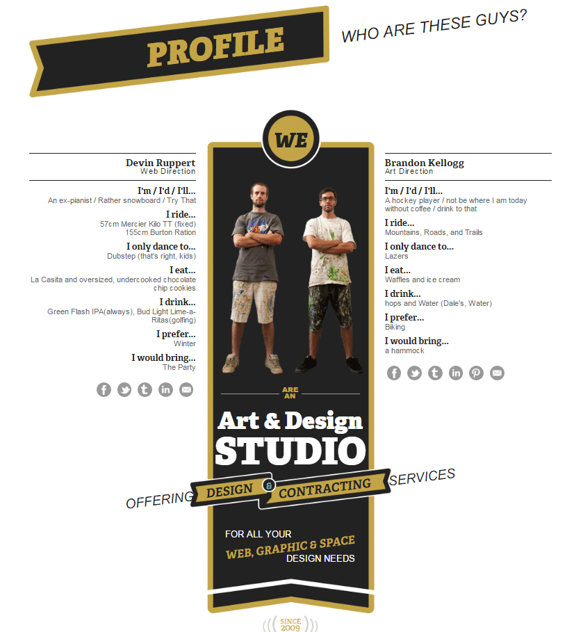
The about page is another great area of your site to explain what your business is all about – build trust, show off a bit, give the user some background into who you are, what you do, and why you do it well.
I don’t think you’ll find many about pages that are more creative and nicely designed than this example from Superfluent (who are, unsurprisingly, designers), but it can’t hurt to draw inspiration from them.

Check out the full about us page here.
Another site worth an honourable mention if only for the internal linking to important pages from the about page is Redbubble – a marketplace where artists and designers can sell their work as prints, or as clothing, home decor, and accessories.

I also like the short video to introduce the brand, and the way they showcase their artists throughout the page (each circle takes you straight to the artist’s page).
Microcopy
If overhauling the design of a whole page just isn’t possible, microcopy can help! Microcopy is handy for:
- Making a page easier for users to understand
- Alerting users to errors i.e. when completing online forms
- Adding small snippets of information
- Emphasising brand messaging
- Reassuring users i.e. when requesting personal details
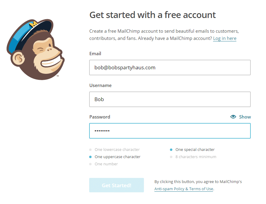
The Mailchimp signup form saves users from making a double derp – it won’t let you hit submit until you enter a password that meets its criteria, and it tells you why.
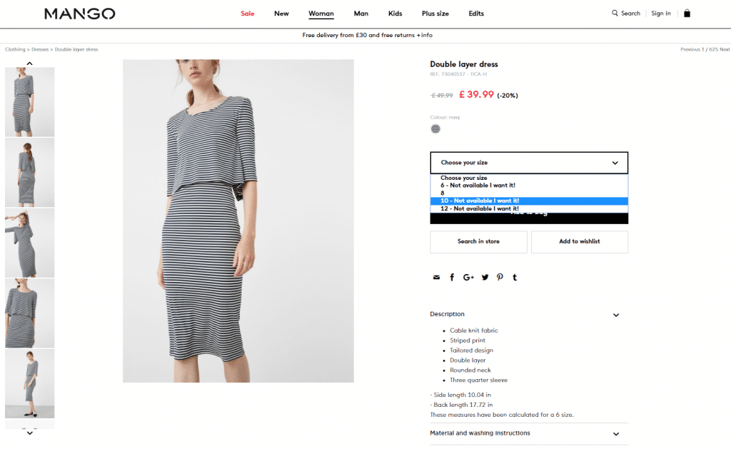
Mango includes an option to be notified when a product comes back in stock – either enter an email address or sign into an account to add to a wishlist. If I’m being picky, I’d like to see some punctuation between ‘Not available’ and ‘I want it’ but hey-ho. Nice bit of microcopy regardless.

In terms of reassurance, The Guardian do a nice job of explaining in very clear, concise terms why they are requesting information from you for each of the fields they want you to complete.
So there we go. Hopefully, you are now feeling inspired to go forth and make even the most mediocre webpages awesome!
Want advice on how to find out and fix the parts of your website that suck? Get in touch with our CRO/UX team today.


