Google Trends is a tool that allows the user to understand which search queries and topics are on the rise and which are on the wane. It can be used to gauge the current hot topics of the moment along with much longer-term trends over many years.
More about Google Trends
It combines misspellings, spelling variations, synonyms, plural, or singular versions of terms and includes searches where words have been added i.e. using Google Trends to research ‘tennis shoes’ would also include searches for ‘tenis shoes’ ‘red tennis shoes’ and ‘tennis shoe’.
It can be filtered via region, date, category and type of content (Web, Image, Shopping, News, YouTube) and the number on the left-hand side of the graph represents the search interest relative to the highest point on the chart for the filters selected. A value of 100 is the peak popularity for the term and a value of 50 means that the term is half as popular. A score of 0 means that there was not enough data for this term.
It’s a pretty handy tool to play around with but if users are not careful they could jump to the wrong conclusions. To explain why, I’m going to use heat pumps as a very timely example.
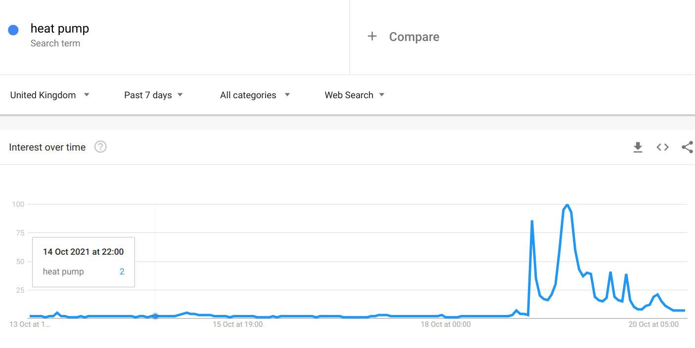
Below is a query for ‘heat pump’ in the UK during the past week. No prizes for guessing when BoJo announced grants for replacing gas boilers with this more environmentally-friendly option.
We all know that the world needs to become more aware of its carbon output so this announcement wasn’t particularly out of the blue and judging by the uplift in the Google Trends graph, there was significant interest from Joe Public. Quick thinking marketing teams could potentially have piggybacked this rise and briefly made hay.
Looking at the query in more context, however, shows that there is a general longer-term interest over time – so those in the industry probably didn’t need to do an immediate knee jerk as they would have seen this pattern emerging.
But what about the actual relative interest compared to gas boilers?
There are approximately 25 million homes in the UK with gas boilers and although the predictions are that whilst 90,000 may be lucky enough to receive a grant, many will not. As prices for heat pumps are relatively high in comparison to a standard gas boiler, it’s likely that the latter will continue to be the preferred option for homeowners for financial reasons, should they need to replace their existing source of heat generation.
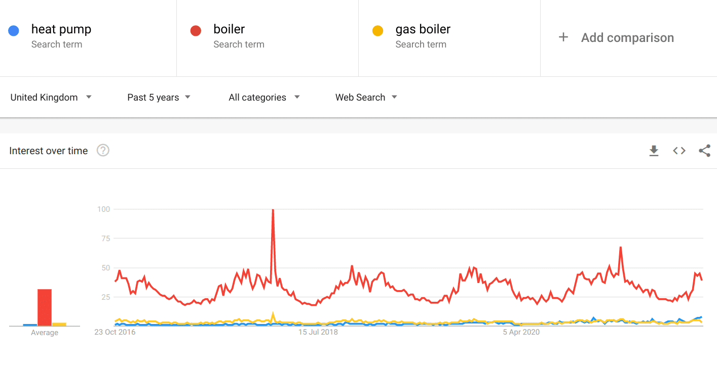
So let’s now compare ‘heat pump’ to gas boilers in terms of trends.
Although ‘gas boiler’ search volumes are not dissimilar to ‘heat pumps’, searches for the term ‘boiler’ alone are significantly higher.
Below we can see seasonal variations for the term ‘boiler’: as you might expect – searches are higher in winter months and lower in the summer. Overall the term ‘boiler’ is significantly ahead in search volumes compared to ‘heat pump’.
So what?
While a heat pump manufacturer will obviously promote their wares year-round, others involved in the HVAC industry in general (heating engineers, stockists, facilities managers etc.) may want to know whether this heat pump bandwagon is something they should be jumping on. More context is required and ideally some real-life numbers.
Of course, if you have a keyword tool then you can find out actual search volumes but they are often lagging by days, weeks or even a month. What can you do if you want to get an idea of search volumes as short term trends emerge in response to the news agenda?
Here’s a hack.
Pop over into Daily Search Trends – probably below the fold on the home page of Google Trends. Although the figures are quite broad, this list of the current trending topics does provide the user with very broad statistics for the top search queries for that day.
As you can see, for Tuesday 19 October ‘heat pump’ was trending and Google estimates that there were 100k searches during this 24 hour period. That’s a pretty decent amount of traffic.

If we put that in context for the week, and we know that ‘heat pump’ had around 100k search volume, we can get a rough idea of how much traffic there was for boilers too:
If the number of searches at the peak of the blue line (at 100 on this graph) represents 100,000 searches, we can then estimate that the number of searches for ‘boiler’ (at 40 on this graph) represents around 40,000 searches.
However, the terms you need to research might not always be in the top trends list but you can choose a completely unrelated term just to get a feel for the numbers:
For example, around the same time, the term ‘Celtic’ was trending (due to the football team beating Hungarian champions Ferencvaros in the Europa League). Clearly, this search term has diddly squat to do with heat pumps but Google Trends Daily Search Trends showed that it received around 200k+ searches.
If we add that data into the heat pumps graph, it does make sense – the peak for ‘Celtic’ traffic is around double that of ‘heat pumps’ at its peak.
As with all things Google Trends, this is an indication not an exact science but it can be helpful when trying to ascertain whether the needle is really shifting on a particular search query in the short term and means you can eek a little more out of the tool.
As for my heat pumps example, there’s no denying the massive spike of traffic indicating interest in heat pumps but it was fairly short-lived and normal levels have resumed – which appear to be around 3-4k per day.
Try it for yourself
Hopefully, you’ve now got a better understanding of how to use Google Trends to find out whether search queries are growing, or shrinking, in popularity. It is a great tool to use so head over to https://trends.google.com/trends/ and have a play around.


