
It is pretty hot at the moment in the UK.
I would describe it as as ‘summer’. I crave sunshine and look forward to the warmth of the summer months, which often feels like a bit of a scarcity in this part of the world, so welcome the fact that summer has finally arrived after a fairly cool spring.
I am less welcoming to the entirely predictable media headlines promising our impending meltdown death and telling us to lock our children inside to escape the killer heat… Rather than launch into a rant about the nanny state and constant fear-mongering, the current media reaction to summer has got me thinking about another obsession of mine – data visualisation.
I think it would be impossible to be a digital marketer without a strong penchant for data analysis. We live and breath data and I am always interested in techniques to help decipher meaning from data and ways to tell a story rather than simply show numbers. Personally, I think that telling a story is really what you should be aiming for when presenting data – what do the numbers actually mean?
Let’s dive back to the weather and consider the story telling aspect of weather charts.
Here is a weather map published by the Met Office in June 2020:

Here is a similar treatment of another classic summer day (sorry, I don’t have the exact date of this map):
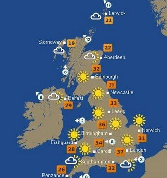
In both these examples, the data visualisation is very simple. The story is that it is going to be sunny and hot. I think the most would probably be pretty chuffed to see this forecast and look forward to dusting off the paddling pool and firing up the BBQ. Happy days.
Roll the clock forward to the past couple of days and a new story is being presented to us:
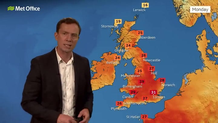
There is no actual mention of the weather, just a suggestion of danger. Red is uniformly a colour of threat and the story here is one of concern, despite actually showing lower temperatures than the example from 2020.
The Met Office treatment is actually fairly moderate when compared to my particular favourite example of imminent apocalypse, which I saw on a certain tabloid:

I accept that this shows an approaching pocket of hot air (or maybe a massive volcano?), which will explain why temperatures are set to soar, but does it really need to be so dramatic? How have we gone from happy suns to deep red danger? Yes, there are those who need to be careful in the heat but the vast majority of folk will simply enjoy some amazing summer weather. It will make a nice change from the usual whinging about the drab weather.
This post is, of course, written with my tongue firmly in my cheek (although I am still angry about the nanny state!), but it does highlight an important aspect of interpreting heatmaps. They are great at showing a range for any data set and they can help you identify the extremes very quickly, but you must always seek to understand the context of the visualisation to avoid misinterpretation.
Heatmaps are very easy to manipulate and can create a very dramatic story if you do not step back and consider the big picture. E.g. the ‘danger red’ 31C temps shown in the recent Met Office data are hot, but not excessively hot. For comparison, we have seen 35.6C in June 1976 and July 2019 peaked at a scorchio 38.7C on 25 July 2019 in Cambridge Botanic Garden. Whilst the current temperatures are a little extreme when compared to the seasonal averages, they are not at all extreme when compared to historical extremes. Although it would not be such a good story, the dramatic heatmaps of recent days would not be so alarming if temperatures were put in context with previous records. Definitely hot, but most definitely not freak weather (for summer).
Just as you need to be careful about the range of data being presented, you should be mindful of colours. Colours can steer your interpretation of the data and tell a story that isn’t necessarily borne out by the actual data. For example, imagine if the recent weather charts were all showing different hues of green – this would immediately suggest that 31C is a good thing and remove the negative connotations of the colour red.
As an aside, you should also be aware of how some of these forecasts are modelled. This is an interesting 60 second summary:
Some weather models are showing extreme heat for the UK from next weekend.☀️🌡️ #UKWeather
But it’s much too early to call.
Here’s Sarah Keith-Lucas to explain why👇 pic.twitter.com/Y2MeywMwTE
— BBC Weather (@bbcweather) July 10, 2022
TLDR – it could hit 40C, but almost certainly will not!
Enjoy the paddling pools and BBQs 🙂