
A FAQ, or help page has the potential to be an extremely powerful tool. Done properly, it can help you establish expertise in your field, improve user experience, and boost conversions.
Yet, it is often one of the most uninspiring and neglected pages on a website.
… I guess that answers a frequently asked question of my own: Why are SO many FAQ pages shoved under the ghastly heading of “FAQ’s” (sigh / cry)?

Aside from getting the grammar police involved, here are some top tips for making sure your FAQs leave no questions unanswered.
Make your FAQ page visible
Firstly, make sure people can actually find the help page. If a user is looking for an answer to a question, they don’t want to then spend ages looking for the page that will answer that question.
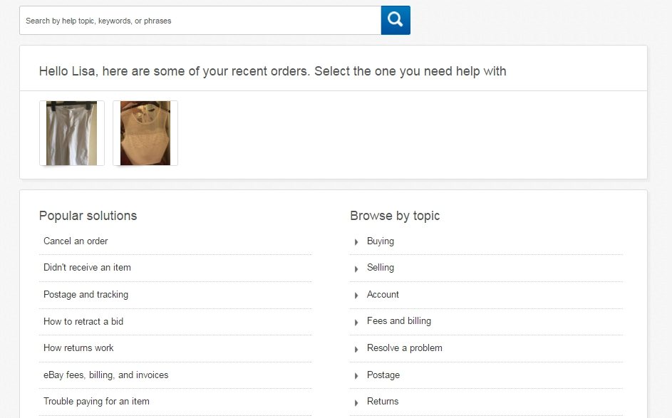
I think Ebay have done a good job of positioning their help button at the top of the homepage – it’s right next to my name, so I don’t have to look very far. If the answer isn’t here, then there’s also a contact section in the same place, so that I can ask them why the heck not.

In one simple click, I arrive at the page, and it’s categorised nicely into topics that are easy to navigate, or I can type in a specific search. I also like the personalised feature, which allows me to quickly get help on individual items I’m selling / buying. A pretty good user experience overall.
Categorise the Fs, from the As and Qs
One of the biggest hurdles in creating a good FAQ page arguably lies in organising such a huge amount of information, into a digestible format. And, if users really are only reading (scanning) 20% of a web page, then that information really ought to stand out.
Ironically, a successful FAQ page will actually have the user reading as little as possible. Therefore, separating answers into distinct categories makes it a piece of cake for users to find exactly what they need, but, if they are met with a page that’s jam-packed full of copy, they could be put off.
From a user perspective, I like the way Dropbox has laid out its help page into twelve concise categories, with icons. I can sail through to the section that I need in just one click.

Focus on the customer
The FAQ page shouldn’t just be treated as an extension of the ‘About’ page. Questions should be relevant to the customer’s needs, and work to provide solution-focused answers. If a user feels any way uncertain about your brand, the FAQ page has the capacity to reassure them, encourage them to stick around for a bit longer… and maybe even make a purchase.
McDonald’s make no minced-steak in recognising that consumers have a big mac stack of burning questions about their products. But, I really like the way they use this to their advantage by adding an entire section of informative articles based on popular consumer concerns such as “do Mcdonald’s chicken nuggets actually contain any chicken?” and so on. The brand even goes a step further by giving me the opportunity to post my own questions.
Loving it or not, McDonald’s help pages really are trying to meat users’ desires to give them a good grilling so, give yourself a pattie on the back, Ronald.

Also great at engaging users by helping them out, is Pinterest. A sleek, interactive FAQ design, offering detailed step-by-step descriptions that will turn anybody into a pro pinner in no time at all. I even get the option to rate each answer on its helpfulness, which is pretty helpful in itself!

Inject personality
Any page on your website should be seen as an opportunity to showcase personality and brand values. Though the details on the FAQ page can perhaps be a little dry, this opportunity is even more applicable.
Delighting users with something exciting and unexpected – be it comedy, visuals, or creativity – instantly strengthens connections and makes your brand stand out against others.
I really like how Innocent drinks manages to stretch its tongue-in-cheek humour to even the dullest part of their website. Even if they have set it out in a cluttered format, and it’s difficult to find.

The content is not 100% helpful and while the little gags probably do err on the self-indulgent side, it’s certainly a refreshing approach and very much in line with the wider Innocent brand.
Point users in the right direction
Lastly, you should avoid making the FAQ page a dead end. Pack it full of prompts to help the user move on to the next stage of their journey. The main purpose of the page is, of course, to provide helpful information to visitors, however adding in calls-to-action or links to other pages across the site will encourage interaction, and maybe even conversion.