Having an in-depth understanding of what content resonates best with your target audience is vital when it comes to developing a successful content marketing strategy. By analysing what’s driving the most social shares, attracting the best links, or sparking discussions more generally, we are able to make more informed decisions about the type of content we produce, where we publish it, and how we promote it.
With this in mind, we wanted to investigate the type of content being produced by digital marketing agencies, to find out how they are approaching their own on-site content marketing; do they practise what they preach, and what can we learn about the collective output?
At the same time, we wanted to test BuzzSumo’s capabilities on a project of this scale. BuzzSumo is a tool we use regularly here at Browser Media but it’s usually for discovering content ideas, building outreach lists, or running reports on a single site or webpage. So how would it perform when given 99 websites worth of content to analyse?
In both cases, the findings were interesting. The first half of this post focuses mainly on BuzzSumo as a content analysis tool, while the second provides a summary of the report findings – however, naturally there is crossover throughout.
Methodology
Step 1. Compile a list of 100 UK-based agencies to analyse. Thankfully The Drum already did this for us, we just had to pull in the URLs. We actually only ended up using 99 agencies because one of the sites was down.
Step 2. Test how many URLs we could get away with running through BuzzSumo’s Content Analyzer before we broke it: it was around 15 URLs in a single query consisting of multiple OR rules, which equates to approximately 400 characters at a time. Something like this:
www.site1.co.uk OR www.site2.co.uk OR www.site3.co.uk OR www.site4.co.uk OR
www.site5.co.uk OR www.site6.co.uk OR www.site7.co.uk and so on…
All of the reports were exported and combined into a Google Sheet, which I’d actually recommend doing even for small projects as it gives you more freedom to play around with the data. BuzzSumo’s dashboard looks nice but is limited in terms of filtering and search functionality.
So after multiple searches and exports, here’s what we had to work with:
- Agency websites analysed: 99
- Total pieces of content analysed: 2,705
- Total social shares analysed: 15k
A few important notes about the data:
- 99 websites were fed into the Content Analyzer but not all featured in the final report. This is because BuzzSumo prioritises content that “drives engagement to present the most relevant results for topics”. In other words, sites publishing content with minimal or no engagement didn’t make the cut.
- We only looked at content from the past 12 months, which did present a small problem. If BuzzSumo isn’t able to determine the correct date of publication, it will use the date the article was first crawled, which may not line up with the date filter. While BuzzSumo did a pretty good job of getting the dates right here, some pieces were missed.
- BuzzSumo’s social metrics are limited to Twitter, Facebook, Reddit, and Pinterest. No LinkedIn, unfortunately.
- I’ll be using the term ‘content’ very loosely throughout this post. While you might expect the Content Analyzer to focus exclusively on articles, blogs, videos and so on, BuzzSumo includes any page on a website that collects social sharing data, which in this case included several homepages, about us pages, and job listings. This didn’t prove to be a big problem in this instance but could potentially skew data under different circumstances.
Content Analyzer
BuzzSumo’s Content Analyzer tool has two main report windows; Search and Analysis.
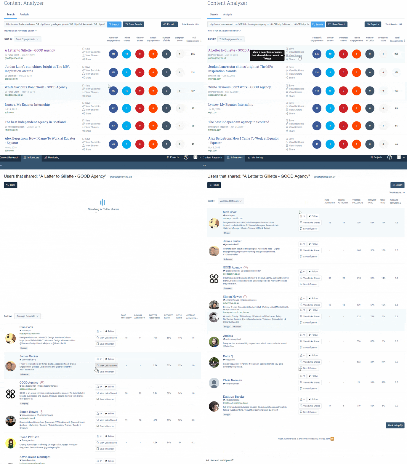
Within the Search report you’ll see a list of the most shared content across the domains you entered (or for the keywords you entered – you can search most popular content by keyword, too) plus some social sharing and link metrics, like so:

By clicking on the links in the second column you can access additional report features. For example, clicking the ‘View sharers’ link will take you to the Influencers report, where you’ll be presented with a list of Twitter users who shared the content, along with various engagement and influence metrics:
Similarly, the View Backlinks option will take you to BuzzSumo’s Backlinks report. The numbers within the Backlinks report can be useful for comparison purposes, but I’m not convinced it’s a powerful enough tool for link analysis in its own right.
To highlight this, I ran the top 50 shared URLs from our report through Link Research Tools (LRT) and it found over 500% more links than BuzzSumo did. I appreciate this is a bit like comparing apples with oranges because BuzzSumo and LRT exist to serve very different purposes, but it does highlight the fact that metrics should never be taken at face value.
From this page, you can also filter results by date, country (TLD), language, domain (you can exclude specific domains), content type (more on that below), word count, publisher size, and B2B publishers only.
The other half of the Content Analyzer is made up of Analysis reports. Here you can gain a more holistic view of the type of content being produced and how it’s being shared, including engagements by content type, by month, day or time, by word count, as well as the most engaged domains overall.
Buzzsumo identifies the following content types: lists, general articles, ‘why’ posts ‘how-to’ articles, ‘what’ posts, infographics, and videos. For example:
List:

General article:

‘Why’ post:

‘How-to’ article:

‘What’ post:

Infographic:

The categorisation of content types is far from perfect. For example, anything with a number at the start of the title is considered a list, which included blog posts with titles such as “5 minutes with…” or “3 award nominations for…”. Similarly, we saw a few infographic posts listed under general articles – presumably because the pages didn’t explicitly mention the word infographic in the title. For the most part though, content categorisation was accurate and didn’t affect the overall report.
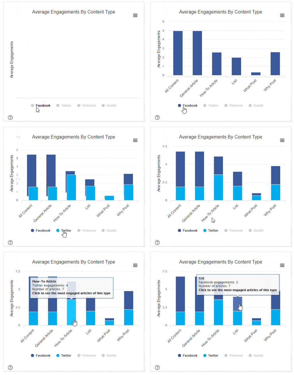
Most of the reports in the Analysis section are interactive and offer basic filtering options and access to deeper information, which can be achieved by hovering over or clicking on certain elements, like this:
This layer of interactivity brings the reports to life and makes the data interesting, however for the purpose of this report I simply exported everything anyway, so didn’t really make the most of it. For smaller projects, there is plenty here to keep users interested.
Report findings
So what did we learn about digital agency content from looking at 2,705 pages? Below are what I consider to be the three most interesting takeaways from the Content Analyzer reports. At a later date, I plan on diving a bit deeper into the specific pieces of content discovered to identify what actually drives social shares, but for now, I think this offers a sufficient summary of findings.
1. Lists get the most shares on average
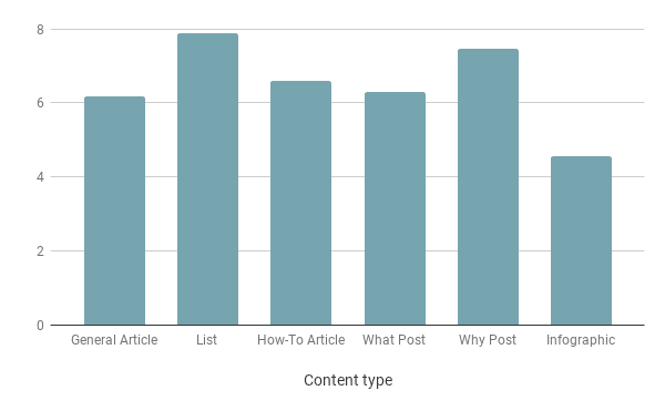
Overall, lists are the most shared content type, gaining 7.8 shares on average per post. This was only slightly higher than ‘why’ posts, which generate 7.4 shares per post on average.
But while averages are useful, they don’t tell the whole story. In this case, the top 20 shared posts were all general articles, with the top performer generating 328 social shares. The fact that the bottom end of the list was also made up predominantly of general articles with no shares brings the average right down.
For context, the most shared ‘what’ post gained 135 shares, the most shared ‘how-to’ article gained 77 shares, and the most shared list gained 76 shares.
Interestingly, videos didn’t feature in our report due to the fact there were so few results. This doesn’t necessarily mean agencies aren’t producing good video content, it might just mean they’re not republishing it on their sites, or that BuzzSumo wasn’t able to recognise the videos on the pages.
Below are some examples of the different content types, all of which featured highly on the most-shared list.
General articles content examples:
- A Letter to Gillette
- Going global report: The UK SMEs making exporting look easy
- From newbie to 383er : An insider’s guide
List content examples:
- Five Advanced Tactics for Keyword Research
- 10 digital marketing tips for small businesses
- 7 Quick WordPress SEO Tips to Maximise Your Search Rankings
‘How-to’ content examples:
- How to create audience segments
- How to influence behaviour change and buyers with your next advertising campaign
- How to fix the broken conversation between content and SEO
‘What’ post content examples:
- What Happens To Culture When You Hire The Wrong Person?
- What is Tik Tok: Beyond a Fad?
- What have we been Googling in 2018?
‘Why’ post content examples:
- Why work five days when you can work four?
- Why link analysis still matters in 2018: a disavow and performance case study
- Why an Intranet
2. Content gets shared most on Thursdays
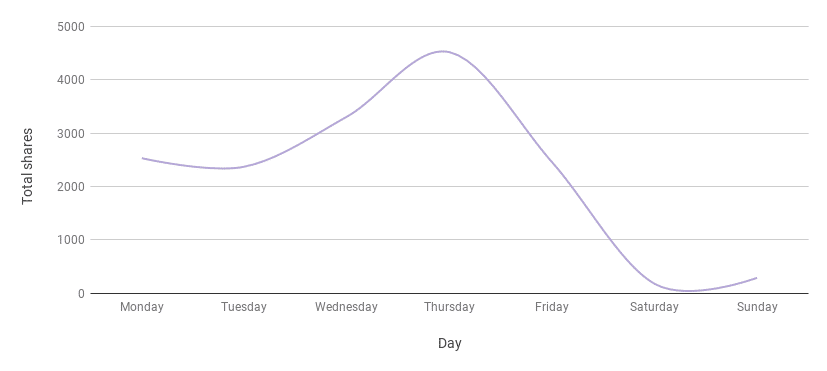
Overall, most shares occurred on Thursdays, while Saturdays were the quietest.
The above graph includes social shares across all four of the networks included in the report, but it’s the same story for Facebook and Twitter when viewed independently. Reddit and Pinterest shares were so low in comparison that we didn’t test individually but had we been looking at consumer-orientated content, this probably would have been different.
3. Word count isn’t everything
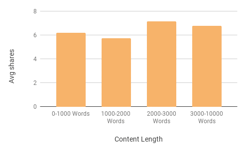
While there are no significant differences in terms of average shares here, content at the wordier end of the scale just edges it. According to the data, the sweet spot is between 2,000 and 3,000 words, but there were plenty of examples of short-form content doing very well too, so there are no definitive rules here regarding content length.
- Five Advanced Tactics for Keyword Research
- How to do an SEO Audit – The Complete Guide
- That year in search marketing [2018]
So what?
While this is all very interesting, social shares only tell a small part of the story. Needless to say, shares don’t always equate to website visits or actual engagement, and there are multiple variables in addition to the above that can influence the ‘shareability’ of a piece of content, some of which are impossible to account for or measure.
What’s more, the results aren’t definitive enough to say whether one particular type of content is better than another. Based on the above you could conclude that lists and long-form content will get shared most and Thursdays see the most action, but realistically there’s so much more to it than that and there are plenty of examples that buck the trend. What is clear is that good content is good content regardless of its structure or word count, but in the same vein creating content based on best practices and averages does not guarantee success.
So with this in mind, I’ll wrap up by saying BuzzSumo is a great tool and I’d thoroughly recommend it to anyone looking to gain deeper insight into their content marketing efforts, but it won’t give you all the answers. Like any piece of marketing software, BuzzSumo requires a degree of manual intervention and this process has reaffirmed that you should never make any decisions based on a report without first gaining an understanding of the data behind it.


